

Your Guide to Printing Large Images Without Losing Quality on a Large-Format Printer
There’s something thrilling about watching a big print roll out of a wide-format printer. The colours, the size, the sheer impact—it feels like your work just stepped into the real world. But if you’ve ever ended up with a print that looked soft, pixelated, or just plain “off,” you know that size alone doesn’t equal quality.
The good news? Large-format printing isn’t complicated once you understand what’s happening behind the scenes. Follow our guide to learn how to print large images without losing quality and get results that look sharp, vibrant and professional every time.
Start with the Right Resolution
Start with a high-resolution image. This is the foundation of print quality.
When an image is enlarged, the printer has to spread pixels over a bigger surface. If the original file doesn’t have enough data, you’ll end up with jagged edges and soft details.
So, how much resolution do you actually need?
- For photo-quality prints, go with 300 DPI (dots per inch) at the final size.
- For posters or banners, 150 DPI is often enough.
- For outdoor signs or billboards, even 100 DPI can look great.
Say you’re printing a 24×36-inch poster. At 300 DPI, that means a file size of 7200 x 10800 pixels. Drop that to 150 DPI and you’ll need 3600 x 5400 pixels—still large, but manageable.
Tempted to just “upscale” a low-res file? Don’t. That’s like blowing up a low-quality phone pic onto a movie screen and expecting a miracle. Instead, always start from the largest, cleanest file possible. And if you’re shooting photos yourself, work with RAW files from your camera. They retain way more data than compressed JPEGs.
Choose the Right File Format
File format matters more than most people think. Each format handles compression differently, which affects the detail and colour in your wide-format print.
Here’s what works best:
- TIFF: The gold standard for large-format printing. It preserves every pixel without compression. Perfect for professional printing.
- PNG: Great for graphics, illustrations, and logos. Keeps sharp edges and transparency.
- PDF: Ideal choice for posters, banners, or mixed media files that combine text and images.
- JPEG: Okay for social media, not recommended for professional prints. Even at the highest quality, it still discards information to save space.
Many clients bring beautiful artwork saved only as a low-quality JPEG. The result? Blurry gradients, weird artifacts, and that telltale fuzziness around edges. So, always keep a “master file” (like a TIFF or PSD) before flattening or exporting. You’ll thank yourself later.
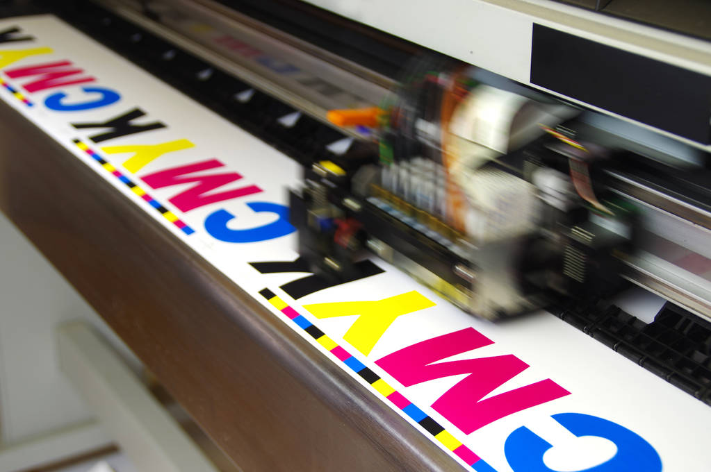
Convert Your Colours Properly
Have you ever printed something that looked perfect on your screen, only to come out too dark or too flat?
That usually happens because of colour mismatches. Your screen shows colours in RGB (red, green, blue), while your printer uses CMYK (cyan, magenta, yellow, black).
RGB can display a wider range of colours than CMYK can reproduce, so when you print an RGB file, the printer has to “guess” which CMYK colours to use. That’s how bright neon blues or deep reds can suddenly look dull.
Before printing:
- Switch your file to CMYK mode in Photoshop or Illustrator.
- Apply the right ICC colour profile for your printer and paper type (for example, “Epson Premium Lustre Photo Paper.icc”).
If you’re sending your file to a print shop, ask for their preferred colour settings. Every printer model interprets colours differently, and this tiny step can prevent major disappointment.
Calibrate Your Screen and Printer
If your screen leans cool and your printer leans warm, you’ll chase colour consistency forever. Calibration bridges that gap.
Use a colour calibration tool (like Datacolor Spyder or X-Rite i1Display) to make sure your monitor displays true colours. Then, print a small test strip to compare. If the print looks darker or more saturated than expected, adjust either the printer profile or your screen’s brightness.
Professional print studios do this regularly because even small shifts in lighting or ink batches can affect colour.
Check Your Software Settings
The “Print” button hides a world of settings that can make or break your results. Take a minute to check them before you hit go.
Look for:
- Print quality: Always set to High or Photo Quality for final output.
- Paper type: Select the exact media you’re using—glossy, matte, canvas, etc. Printers adjust ink flow and drying based on this.
- Scaling: Set to 100%. Always resize in your design software, not the printer dialogue.
- Colour management: If you embedded an ICC profile, turn off “Printer manages colours.”
Pick the Right Paper or Media
Paper matters more than people think. The same file can look completely different depending on what it’s printed on. Here’s a quick rundown:
- Glossy photo paper: Pops with contrast and saturation—great for photography or advertising.
- Matte paper: Softer and elegant, perfect for art prints or architectural plans.
- Canvas: Adds texture and a handmade feel. Works beautifully for artwork or interior décor.
- Vinyl or banner material: Tough and weatherproof for outdoor displays.
- Backlit film: Used for lightboxes and signs where illumination comes from behind.
Always use media rated for your wide-format printer type. Inkjet, solvent, and latex printers require different coatings for ink adhesion and drying.
Think About Viewing Distance
A print meant for close inspection should be razor sharp. One meant to hang three metres away doesn’t need to be. So, ask yourself: How far away will people be when they look at this?
If it’s a fine art print or product photo, go for maximum sharpness (300 DPI). But if it’s a trade show banner, no one’s sticking their face in it. 150 DPI looks just as good from a few steps back. For outdoor signs and banners, 75–100 DPI is typically ideal. Industry sources note that large-format prints can look acceptable at resolutions as low as 100 DPI when viewed from a distance.
Go Easy on the Editing
You know that urge to “make it pop”? We’ve all been there. But heavy editing can often backfire.
Large prints magnify everything—including your edits. Overdone sharpness can cause haloing, and too much noise reduction can make textures look flat or fake, and excessive contrast can make colours look unrealistic.
To keep it subtle:
- Sharpen specific details (like eyes or textures) rather than the entire image.
- Use gentle contrast adjustments.
- Avoid pushing saturation too far—colours should feel rich, not radioactive.
- Check your work at 100% zoom before printing. If your file looks natural up close, it’ll look stunning when printed large.
Always Do a Test Print
Never send a huge job to print without a small trial first. Print a small 4×4-inch section that includes fine details—text, skin, or complex textures. You’ll instantly see if your colours or sharpness need tweaking. If something looks off, you can adjust without wasting a whole roll of paper or litres of ink.
Large-Format Printing: From Trial to Mastery
Large-format printing comes down to understanding both the technical details and the creative judgment behind them. Once you know the rules, you can bend them a little—recognising what truly affects quality and what doesn’t.
The first few times might feel like trial and error. That’s normal. But once you’ve printed a few jobs successfully, you start to develop an eye for what works: how colours translate, how resolution holds up, and which paper feels right. When you finally see your image, full size, vivid and sharp—it’s worth every adjustment.
So, go ahead and print big! And if you run into issues with your printer, our team at Printer Repair Centre can help. We specialise in a range of services, including plotter repairs, large-format printer maintenance, and general troubleshooting. Whatever the challenge, we will make sure your printing equipment performs at its best. Get in touch with us today to learn more.

